Fix It Phil: Modernizing an Outdated Local Service Website
A modern website redesign for a Doylestown remodeling business, with clearer services, stronger visual hierarchy, and a mobile experience built around easy contact.
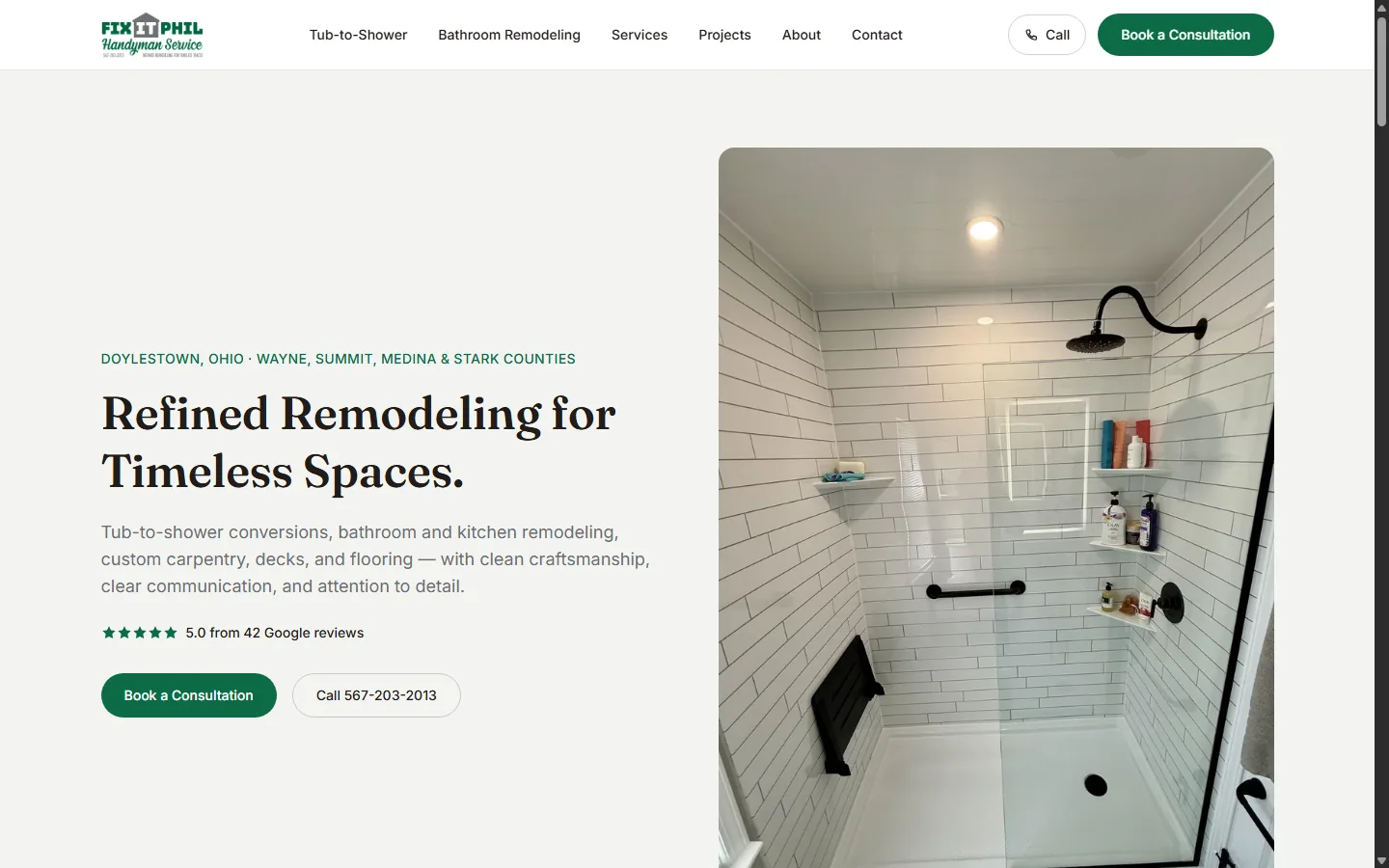
Opens in a new tab
Click to visit the live site at letphilfixit.com.
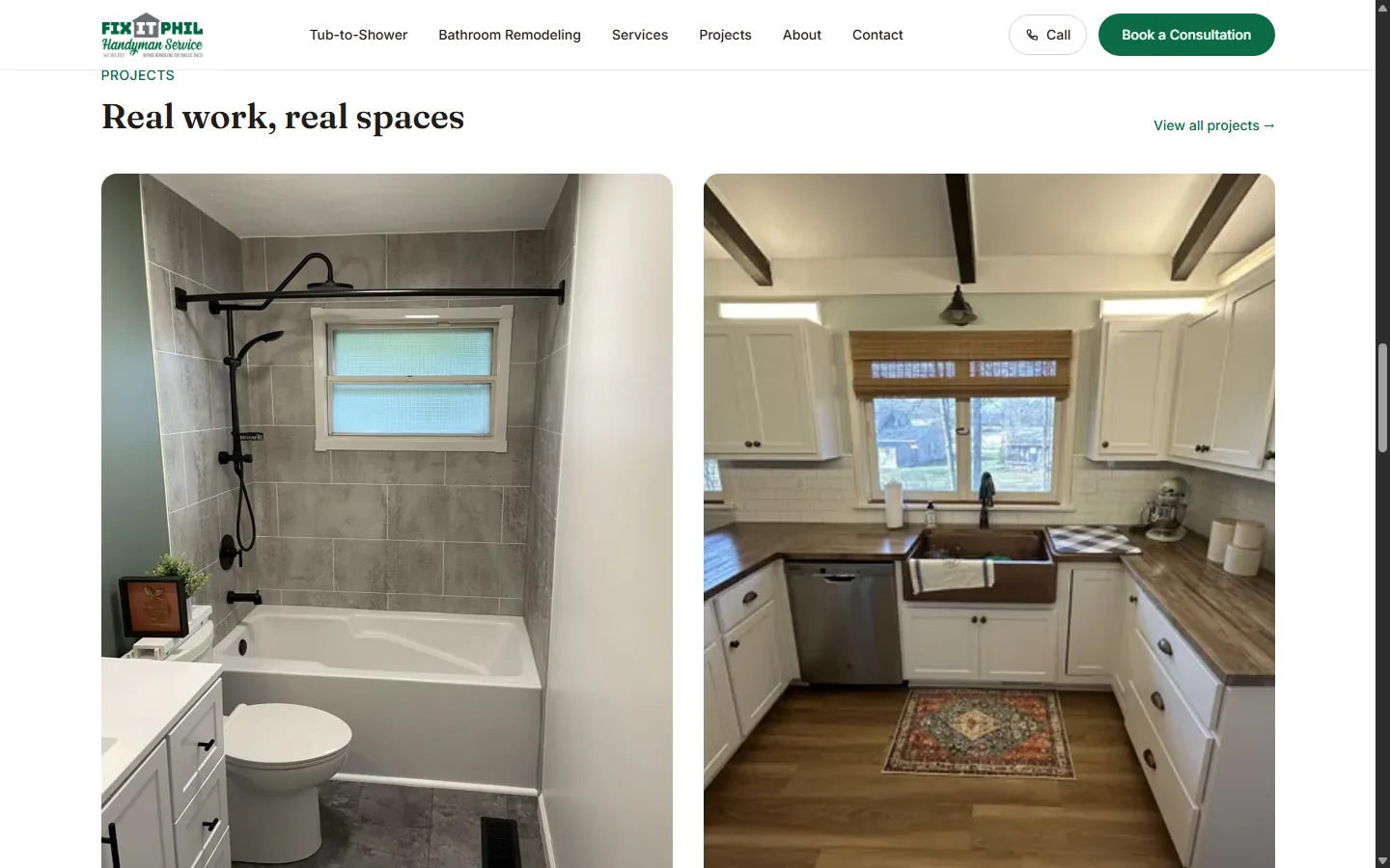
Real Project Work, Presented Clearly
From Dated to Clear and Modern
A design and usability comparison. No old-site screenshot or performance figures are available.
Dated, template-style visual presentation
Modern design grounded in the business’s real work
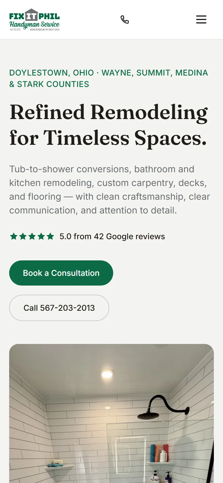
Awkward layout on smaller screens
Responsive layout with readable content and clear actions
Less intuitive route to key information
Services and examples organized for easier browsing
Customer journey needed clearer direction
Consultation and phone options presented prominently
The Problem Holding the Business Back
Fix It Phil already had a website, but its older template-based presentation felt dated and did not reflect the quality of the business. The layout was awkward on phones, the information was less intuitive to find, and potential customers needed a clearer path from browsing services to getting in touch.
Modernize the experience without losing the practical information local homeowners need: what Phil does, examples of his work, and how to start a conversation.
A Modern, Mobile-Friendly Rebuild
Clear Line rebuilt the website around a clean visual system, understandable service paths, real project imagery, and prominent consultation and call actions. Responsive layouts make the same core information easier to use on a phone.
- Organized remodeling services into clearer navigation and page sections
- Used considered typography and spacing to establish a stronger hierarchy
- Put real project photography near the services it supports
- Placed consultation and phone actions where visitors can find them
- Adapted the layout for phone, tablet, and desktop screens
- Kept the browsing path simple for local homeowners
3 Priorities of the Redesign
Clear Contact Paths
Calls to action help visitors move from a service or project example to a conversation with Phil. The design makes the next step visible without interrupting the work showcase.
- Visible consultation action
- Direct phone contact
- Contact options near relevant content
Visual Hierarchy & Navigation
More deliberate typography, spacing, and navigation help homeowners scan the page and understand the range of remodeling services.
- Readable service groupings
- Real project imagery
- A consistent visual rhythm
Mobile Experience
The new layout gives phone visitors readable content, a focused menu, and direct contact actions. Mobile usability was a central part of this redesign.
- Responsive page sections
- Phone-friendly navigation
- Easy-to-reach call and consultation options
Project Highlights
Modern Local Business Presentation
Responsive, Readable Layouts
Real Project Photography
Clear Contact Actions
A Professional First Impression on Every Screen
The current site pairs a restrained visual style with real bathroom and kitchen project photography. Visitors can understand the services, see the work, and choose a contact path from desktop or mobile.
Client Experience & Collaboration
Philip’s review describes a professional process from start to finish and communication that was easy throughout. His feedback is the clearest evidence of how the collaboration felt to the client.
"Owen did a wonderful job creating my new website. Everything was handled professionally from start to finish, and he was very easy to communicate with throughout the entire process. I’m very happy with how everything turned out and had a great experience working with him."
Philip Neiswander
Owner • Fix It Phil
Doylestown, OH
What Changed
Want results like this for your business?
Tell me about your business and I'll follow up with a free, no-obligation quote.